
Does Quantitative Easing Contribute to Income Inequality?
By: Jackie Connor
Background to Quantitative Easing
As Quantitative Easing (QE) lacks an extensive history, the monetary technique, despite recent use by numerous central banks, is fraught with controversy[1]. QE occurs when a central bank increases the money supply, often by buying government bonds through open market operations from companies and institutions.[2] The goal is to increase liquidity, borrowing, investments, and economic activity.[3] However, QE is associated with some negative side effects, making it a last resort strategy used after traditional methods – such as when official interest rates are near zero – have been exhausted. One of the apparent downsides is QE increases income inequality. Is this claim legitimate?
Income Inequality
Income Inequality (II) is defined as the unequal distribution of income within a population.[4] There are multiple common methods of measuring income inequality, including the GINI index, the generalized entropy index, and the decile ratio.[5] Various factors can affect the degree of income inequality, such as monopolistic control by leading families, cultural structures, legal constructs, favorable tax treatment for the rich, regulatory favoritism, decreasing labor union strength, or technological change.[6] Based on historical data, countries not in the Organization for Economic Cooperation and Development (OECD), such as China, have a larger income disparity than those in the OECD. Past research also indicates that among OECD countries, the USA and Latin America have higher levels of income inequality. Overall, the recent trend has been increasing income inequality.[7]
Using Government Yields to Measure Quantitative Easing
Government yields refer to the interest, or the amount of money made at maturity, on government bonds.[8] Specifically, we use US Treasury Bill yields. Due to the United States federal government’s credibility and low default rate, yields on Treasury Bills have low systematic and unsystematic risk. As a result, they are a better measure of QE’s impact than stocks or bonds.
QE has an inverse relationship with government yields. The more easing, the lower the yields because QE increases money supply, decreases the supply of Treasuries through purchases by the central bank, which in turn, decreases yields.[9]
It should be noted, as QE affects many aspects of the economy, other measures – such as the inflation rate – can potentially be used. However, we use Treasury yields because they have a more direct connection to QE than other measurements.
The Association Between the PE Ratio, Shiller PE Ratio, and Income Inequality
The typical Price to Earnings (PE) Ratio compares price per share to earnings per share. The Shiller PE Ratio, an adaptation of the typical PE ratio, divides the current price per share by the average inflation-adjusted earnings from the past 10 years.[10] The share price in PE Ratios is often an indication of corporate profits, as the ratio will be higher if earnings expectations remain positive.[11]
A higher ratio is directly associated with higher income inequality. Higher share prices often increase income inequality as the gains mainly go to the wealthy, who own stocks at higher rates than the poor.[12] In fact, the wealthiest 10% own 91.4% of stocks and mutual funds.
Methodology
First, we examine the correlation between quantitative easing and income inequality in the USA. Second, we examine the United States’ historical GINI index data. Third, we compare, contrast, and analyze the observations from the QE/II correlation and GINI index.
Establishing a Mathematical Correlation between Quantitative Easing and Income Inequality Within the USA:
To determine this result, we utilize the beginning of the year data for the yields of the three-month Treasury bill rates as provided by the Federal Reserve of St. Louis[13], and Shiller PE Ratio as provided by Robert Shiller in his book Irrational Exuberance.[14] Yields and PE ratios are useful measures of easing and income inequality, respectively. We examine data from two time periods: 1990-2008 and 2009-2013. The results are sometimes labeled as QE/II correlations.
1) 1990-2008:
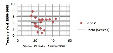
The first time period, from 1990-2008, is significant. During that time the United States did not use QE. In this period, the yield decreased from 7.64% to 2.75% and the PE Ratio increased from 17.05 to 24.21. The correlation between these two variables is -0.03658. This inverse relationship indicates that income inequality increased during this period. However, based on Dancey and Reidy’s 2004 categorizations, this is essentially a nonexistent correlation, as it is less than -0.1.[15]
A) 1990-1999:
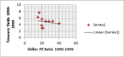
It is worth examining two subsections of this first time period: 1990-1999 and 2000-2008. Between 1990-1999, the PE ratio increased while the yield fell. The inverse -0.23704 correlation suggests income inequality increased. However, the QE/II correlation remains weak during this period.
B) 2000-2008:
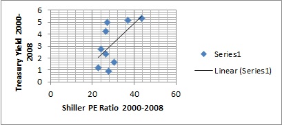
The 2000-2008 period witnessed a positive correlation of 0.617692 where both the PE Ratio and Treasury yields fell. Unlike the 1990 to 1999 time frame, this correlation is generally considered to be relatively strong, indicating that income inequality decreased in the absence of QE. We investigate the reasons for the difference between these two subsections in a later section.
2) 2009-2013:
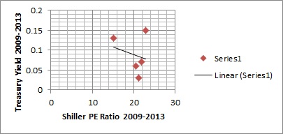
Next, we examine the 2009 to 2013 period, during which time the United States enacted quantitative easing policies. Quite unlike the 2000-2008 period, there is a weak inverse correlation at -0.22582. We examine why this increase in income inequality may have occurred due to quantitative easing and determine why this is a stronger inverse correlation than the simple correlation between PE Ratios and quantitative easing suggests.
Facts About the USA’s GINI Index:
We can measure the actual income inequality that occurred within the USA at different time periods using the GINI index. The GINI Index measures income inequality through the Lorenz Curve, which shows the cumulative income earned within the population starting from the lowest earners to the highest. A GINI coefficient of 0 represents no inequality, while 1 means one person has all the income.[16] Thus, the higher the GINI coefficient, the greater the inequality. At the time of writing, the United States GINI coefficient is available up to 2011. We therefore compare the coefficient from the 1990-2008 period to the coefficient from the 2009-2011 period.[17]
1) 1990-2008:
Between 1990 and 2008, the coefficient increased from 0.428 to 0.466, for a total increase of 0.038, or approximately 9%. When we divide this by the total number of years, we witness an average increase of 0.002 per year, suggesting that there was an increase in income inequality during this period.
Although the trend from 1990-2008 overall shows worsening income inequality, there were multiple years where we witnessed a decline in income inequality: 1994-1995, 1997-1998, 2001-2002, and 2006-2007.
A) Before 2000 vs. After 2000:
A closer examination of the 1990-2008 period shows the increase occurred primarily before 2000. 1990-2000 accounts for 0.034 of the total increase of 0.038. Thus, from 2000-2008, the index increased only 0.004, accounting for only 10.5% of the total increase during 1990-2008. As discussed earlier, there was a much more significant increase in income inequality in the former period. It is also clear despite the small change from 2000-2008, inequality increased nevertheless.
2) 2009-2011:
From 2009 to 2011, the coefficient grew by more than it had from 2000 to 2008. It increased by 2%, from 0.468 to 0.477, a difference of 0.009 in total, or 0.003 per year. There were no decreases during any of these years. Thus, income inequality worsened the most during this time, with a larger increase than that of the 1990-2008 era.
Analysis of QE/II Correlations and GINI indexes:
When comparing the results from the QE/II correlation and GINI coefficient data, the 1990-2008 and post 2009 periods suggest increasing inequality overall.
2000-2008 Divergence of GINI and QE/II
However, when taking into account subsections of the first period, the QE/II correlation and GINI index do not reach the same conclusion for the 2000-2008 period. The GINI coefficient suggests that income inequality still increased from 2000 to 2008, but the QE/II correlation indicates otherwise.
There are several reasons for this difference. First, PE ratios are not necessarily indicative of corporate financial health because the share price also is a product of investor confidence – which was unusually high during the 2000-2008 period even though the underlying data suggested the market would eventually falter – rather than an objective indicator of a company’s financial health or profits.[18] This leads to a false positive QE/II correlation. Second, as the Shiller PE Ratio is based on the previous 10 years’ earnings and the 2000-20008 period is not a 10 year block, therefore, other events and factors played a role.[19] For example, the 1998 crash most likely led to smaller earnings for that year, which was included when calculating the 2000-2008 Shiller PE Ratio. Such events can make the denominator smaller, meaning a larger PE ratio and an altered QE/II correlation.
Furthermore, the PE ratio does not take into account which groups are the key recipients of corporate profits, only the sum total of the profits. Thus, it fails to take into account the offshoring and job losses that particularly harmed certain groups of the US population. This is problematic as companies are increasingly operating internationally with success.[20] If that reason is taken into account, income inequality would be higher than the QE/II correlation suggests because international competition lowers household incomes. Therefore, it appears that the QE/II correlation for 2000-2008 suggests less inequality than there is actually. Due to these circumstances, the GINI index may be a more holistic data point than the QE/II correlation for that period.
This rationale can also be applied to the 2009-2011 period to illustrate that the QE/II correlation suggests a weaker correlation than it should. With unusually low investor confidence, the price per share was also unusually low. Likewise, the denominator (earnings) is larger than it should be due to the fact that the Shiller PE ratio considers ten years of corporate earnings, which include earnings for the years when the economy grew; this masks the sharpness of the increase in income inequality.[21] The offshoring of jobs continued during this time period, another contributing factor to greater actual income inequality in practice than the QE/II correlation suggests.
Furthermore, the declines in income inequality suggested by the GINI index were likely caused by other factors. During 1994-1995, 1997-1998, and 2001-2002, the technological boom, rather than the lack of easing, may explain why income inequality decreased. While one may expect to see a decrease each year, other economic variables may have played a role in the years 1995-1997 and 1999-2000. Nevertheless, the boom most likely contributed to these reversals. Furthermore, 2006-2007 were the peak years of the housing bubble. The greater number of homes sold during this period may have resulted in a temporary, one-time increase in household incomes that skewed the income data to make incomes appear higher than they otherwise would be.
Similar Trends of GINI and QE/II
Despite the fact there are some differences between the two, a general trend exists based on the comparison of the GINI coefficient and the QE/II correlation. Income inequality worsened more sharply after 2009 than during other periods. In contrast, it worsened the least during the 2000 to 2008 period. There are logical reasons why QE increases income inequality, providing support for possible causation.
Reasons behind Quantitative Easing’s Association with Income Inequality
The list below is not exhaustive, and describes the most significant connections between easing and income inequality.
1) Inflation
By trying to stimulate the economy, quantitative easing attempts to increase spending and thus achieve a desired price level and desired inflation rate. However, it may lead to a higher inflation rate than intended.[22] This affects the value of wages, annuities, and pensions. People already suffering from financial hardship due to the weak economy will have to tighten their budgets further to accommodate an additional loss in their purchasing power and incomes.
2) Annuities
Many retirement programs contain yields, a percentage that indicates the annuity, or income, a person will receive during a specified time period. Under a QE regime, these yields are lowered.[23] Lower yields translate into lower incomes for retirees, many of whom rely on annuities for their day-to-day needs.
3) Pension Funds
Like annuities, pension funds are affected by QE in more than one way. Lower interest rates due to quantitative easing harm pension funds by increasing their liabilities, as lower interest rates result in a higher net present valuation for liabilities. In other words, lower rates result in a higher present value of future liability obligations. This means that corporations need to divert money from investments or hiring to fund their pension plans.[24] However, corporations may be unable to do so, leaving those who depend on such plans, often lower-income individuals, with reduced payments or nonpayment.[25]
4) Investment and Borrowing Opportunities
Decreasing interest rates, a result of QE, often lead to increased borrowing. However, the opportunity to borrow and invest money is typically limited to those who are already wealthy and have good credit scores.[26] When these investments bear fruit, the money returns to investors in the form of income. Those who do not have good credit scores – who are most likely to be comparatively poorer – miss out on these opportunities, leading to increased income inequality.
5) Corporate Profits Versus Worker Wages
As mentioned earlier, QE leads to lower interest rates, resulting in more borrowing and investment opportunities, including for corporations. Successful investments ultimately result in higher corporate profits. However, these typically go to executives and shareholders, who are wealthier; poorer workers do not experience similar benefits.[27]
6) Stocks and Profits Versus Worker Wages
As suggested by the correlation shown earlier, quantitative easing leads to increased share prices. Demand for the central bank’s bonds decreases due to their low rate of return. Equities offer higher returns and investors flock towards stocks, which raises their prices.[28] Second, as highlighted in (5) above, corporations are investing more and consequently have greater potential to make extra profits, which is attractive to shareholders.[29] The wealthiest benefit more from increased share prices and corporate profits. Income inequality is further exacerbated when wages for workers, who do not tend to own stocks, do not increase by a similar amount.[30]
Consequences of Quantitative Easing on Developing Countries
As nations in global economy are interconnected, changes in United States QE policy affects other countries, including developing nations. There are two primary manifestations of US quantitative easing in other countries: increased inflation and liquidity.[31]
The United States’ QE affects the currency exchange rates of developing countries. When a country like the United States utilizes easing to devalue its currency, other emerging economies may be compelled to depreciate their currencies to maintain a competitive trade advantage. However, further devaluation by emerging economies, especially a permanent one, leads to more unwanted inflationary pressure on emerging economies.[32] As indicated earlier, inflation can aggravate income inequality by negatively affecting purchasing power.
Additionally, QE leads to increased capital outflows to developing countries[33] through an increase in private investments. These outflows often end up in emerging economies’ portfolio investments.[34] Like the effects of increased share prices, such investments in securities and stocks often benefit the wealthy.
Ethical Implications: Distributive Justice
Distributive justice theory focuses on society’s framework for distributing benefits and burdens.[35] First, in some ways QE may not provide equal opportunity. Access to money created by QE occurs primarily through stocks. As noted earlier, the wealthy own the most stocks due to their ability to invest while still meeting their basic needs. The poor, who struggle to survive, cannot afford to invest in stocks. Such access is also available to executives who reap the benefits of corporate profits. However, the poor, typically retirees or low skilled workers, are not executives and tend not to enjoy trickle down benefits from corporate profits. They therefore, do not receive any financial benefits from quantitative easing policies.
Although the correlation within the USA is weak, it indicates that QE negatively affects income inequality and thus does not achieve distributive justice in the US. The USA’s QE also fails to help other countries achieve distributive justice since their income inequality is affected as a result. Furthermore, other indicators, such as the disparity between the poor and rich’s consumer sentiment, support the argument that QE aggravates income inequality. After QE policies were implemented, the rich, who gained more and lost less, had significantly more positive sentiments about the health of the economy and their personal financial prospects than the poor.
Practical Implications of Failing to Achieve Distributive Justice
Overall, in the short run, income inequality may encourage social unrest when the poor articulate their dissatisfaction and desire for a higher standard of living.[36] Examples include the 2011 London riots[37] or the Occupy Wall Street and Greek protests.[38] Unfortunately, these implications are not only applicable to the present. Income inequality also hampers countries’ economic prospects in the long term. It creates a permanent underclass and limits intergenerational economic mobility.[39] This occurs because poorer children grow up in an environment where they receive a worse education, harming their future livelihoods. Furthermore, the poor are prompted to borrow more than they should in order to meet their needs[40], increasing the risk of a financial crisis. As the poor have low incomes, they cannot help drive economic activity, rely on welfare, consequently further harming a country’s long term economic potential.
We analyze the short and long term implications of income inequality in more depth by organizing countries into two categories: developed and developing nations. These countries have different social, political, and economic characteristics and thus face different specific risks from income inequality.[41]
As developed countries have more stable political, legal, social, and economic systems, their economies are likely to experience some positive benefits of quantitative easing without being destabilized from social unrest. Even so, they might experience unrest to some degree. The complications associated with small-scale protests and unrest may still harm the prospects of other, potentially better, solutions and require a short-term response. Additionally, as these countries are not growing or reorganizing their economies, income inequality becomes ingrained, creating a long-term problem.[42]
In contrast, developing countries are less established and stable, heightening the short-term risks of income inequality. Adding extra instability may in fact plunge such countries into violence or internal strife, which can last for a significant amount of time and cancel out any short-term growth that result from QE. Furthermore, a developing country is likely to have unstable institutions, often riddled with corruption, and lacking institutional power. This factor puts the country’s future at risk if the institutions make unwise decisions, creating the conditions for financial bubbles. The run up to the 1997 Asian financial crisis is one example.[43] However, unlike a developed country, a developing country’s growth allows it a chance to reduce income inequality.[44]
The failure of QE in providing distributive justice potentially risks the wellbeing of both developed and developing countries.
An Alternative Proposition
As QE is not effective in reducing income inequality, an alternative tool may help the economy and be more effective at combating income inequality.
Implementing a direct jobs program may resolve the problem posed by QE, especially if the program strengthens infrastructure, enhancing a country’s growth prospects.[45] This would naturally help businesses grow as well as bolster the incomes of workers, so long as they earn more than unemployment benefits gives them. Furthermore, such a program trains workers, helping their long term earning potential, and decreasing income inequality.
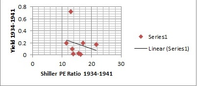
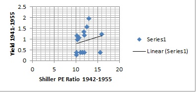
Some may argue this was attempted in the 1930’s and was not successful. The attempt by Roosevelt before the war was unprecedented for its time, but not large enough to reverse the Depression. However, the economy revived with World War II, which was essentially a jobs program. This does not necessarily mean we should enter more wars; this simply suggests a jobs program can work. The mathematical correlations from 1934 to 1941, before the US entered the war, and from 1941-1955, which includes the war and some time after the war, support this proposition. The correlation between the Shiller PE Ratio and Treasury Yields from 1934 to 1941 is -0.23445, whereas it is 0.222655 in the later period. While the correlation is weak, it seems to indicate that the war reversed the trend from increasing inequality to decreasing inequality and does a better job than QE.
Furthermore, some may claim that such a program is difficult to implement as it must pass the legislature. If the government needs to act quickly, then it should consider doing both a quantitative easing program and a direct jobs program simultaneously. QE can be enacted easily by the Federal Reserve and bring positive benefits in the short term. The direct jobs program, which can be executed in a decent time frame, given pressure from a public that understands the benefits of a jobs program, can limit or reverse the income inequality caused by quantitative easing policies. However, it should be emphasized that a purely jobs-centric approach is probably the best way to tackle long-term economic problem of economic disparity.
A Chinese translation of this article may be found HERE.
Photo: Courtesy Flicker, straightedge217
[1] “QE, or Not QE?” The Economist. July 14, 2012. http://www.economist.com/node/21558596.
[2] “What Is Quantitative Easing?” BBC News. March 7, 2013. http://www.bbc.co.uk/news/business-15198789.
[3] “QE, or Not QE?” The Economist.
[4] Mackintosh, Eliza. “Report: Income Inequality Rising in Most Developed Countries.” The Washington Post. May 16, 2013. http://www.washingtonpost.com/blogs/worldviews/wp/2013/05/16/report-income-inequality-rising-in-most-developed-countries/.
[5] De Maio, F. G. “Income Inequality Measures.” Journal of Epidemiology & Community Health 61, no. 10 (October 2007): 849-52. doi:10.1136/jech.2006.052969.
[6] Markovich, Steven J. “The Income Inequality Debate.” Council on Foreign Relations. September 17, 2012. http://www.cfr.org/united-states/income-inequality-debate/p29052.
[7] Mackintosh, Eliza. “Report: Income Inequality Rising.”
[8] Introduction. In International Financial Statistics Yearbook, Xvii. Washington D.C.: IMF, 2000. http://stats.oecd.org/glossary/detail.asp?ID=1391.
[9] Blumberg, Deborah Lynn. “No Fix in Quantitative Easing.” The Wall Street Journal. October 18, 2010. http://online.wsj.com/article/SB10001424052748704049904575554530630999098.html.
[10] Marotta, David John. “The Shiller Ten-Year P/E Ratio.” Forbes. April 30, 2012. http://www.forbes.com/sites/davidmarotta/2012/04/30/the-shiller-ten-year-pe-ratio/.
[11] Ferri, Rick. “A Second Look at P/E Ratios (Part II).” Forbes. October 25, 2012. http://www.forbes.com/sites/rickferri/2012/10/25/a-second-look-at-pe-ratios-part-ii/.
[12] “The Rich and QE.” The Economist. June 3, 2013. http://www.economist.com/blogs/buttonwood/2013/06/investing-and-monetary-policy.
[13] “3-Month Treasury Bill: Secondary Market Rate.” Chart. Economic Research: Federal Reserve Bank of St. Louis. July 8, 2013. http://research.stlouisfed.org/fred2/series/TB3MS?cid=116.
[14] Shiller, Robert. “Shiller PE Ratio.” Chart. In Irrational Exuberance. 2nd ed. New York: Crown Business, 2006. Accessed July 13, 2013. http://www.multpl.com/shiller-pe/.
[15] “Correlations: Direction and Strength.” University of Strathclyde. Accessed July 13, 2013. http://www.strath.ac.uk/aer/materials/4dataanalysisineducationalresearch/unit4/correlationsdirectionandstrength/.
[16] “GINI Index.” The World Bank. Accessed July 13, 2013. http://data.worldbank.org/indicator/SI.POV.GINI.
[17] “Income Gini Ratio for Households by Race of Householder, All Races.” Chart. Economic Research: Federal Reserve Bank of St. Louis. September 24, 2012. http://research.stlouisfed.org/fred2/series/GINIALLRH.
[18] “Price/Earnings (P/E) Ratio.” Inc. Accessed July 14, 2013. http://www.inc.com/encyclopedia/price-earnings-p-e-ratio.html.
[19] Smith, Aaron. “5 Flaws in a Simple Price to Earnings (PE) Ratio.” Stock Trading To Go. Accessed July 14, 2013. http://www.stocktradingtogo.com/2009/05/07/investing-price-to-earnings-ratio-pe/.
[20] Levine, Linda. Offshoring (or Offshore Outsourcing) and Job Loss Among U.S. Workers. Report. Congressional Research Service, 2011. http://forbes.house.gov/uploadedfiles/crs_-_offshoring_and_job_loss_among_u_s__workers.pdf.
[21] “Is the Market Really Overvalued? A Few Problems With CAPE Valuations.” Interview by Liz Ann Sonders and Morgan Housel. The Motley Fool. April 17, 2013. Accessed July 14, 2013. http://www.fool.com/investing/general/2013/04/17/is-the-market-really-overvalued-a-few-problems-wit.aspx.
[22] Insley, Jill. “Quantitative Easing: Its Effect on Annuities, Pensions and Inflation.” The Guardian. July 05, 2012. http://www.guardian.co.uk/money/2012/jul/05/quantitative-easing-affect-annuities-pensions-inflation.
[23] Ibid.
[24] “Finding the Right Rate.” The Economist. December 11, 2012. http://www.economist.com/blogs/buttonwood/2012/12/pensions-squeeze.
[25] Insley, Jill. “Quantitative Easing: Its Effect.”
[26] Plumer, Brad. “Will the Fed’s Efforts to Boost the Economy Only Benefit the Wealthiest?” The Washington Post. August 24, 2012. http://www.washingtonpost.com/blogs/wonkblog/wp/2012/08/24/will-the-feds-efforts-to-boost-the-economy-only-benefit-the-wealthiest/.
[27] Schwartz, Nelson D. “Recovery in U.S. Is Lifting Profits, but Not Adding Jobs.” The New York Times. March 3, 2013. http://www.nytimes.com/2013/03/04/business/economy/corporate-profits-soar-as-worker-income-limps.html?pagewanted=all&_r=1&.
[28] Lim, Paul J. “In Round 3 for the Fed, a Challenge for Investors.” The New York Times. September 22, 2012. http://www.nytimes.com/2012/09/23/your-money/quantitative-easing-and-investor-choices-fundamentally.html?_r=1&.
[29] Ferri, Rick. ” Second Look at P/E Ratios.”
[30] Stewart, Heather. “Quantitative Easing ‘is Good for the Rich, Bad for the Poor'” The Guardian. August 13, 2011. http://www.guardian.co.uk/business/2011/aug/14/quantitative-easing-riots.
[31] Saran, Shyam. “Quantitative Easing: Impact on Emerging and Developing Economies.” Inter Press Service. June 5, 2013. http://www.ipsnews.net/2013/06/quantitative-easing-impact-on-emerging-and-developing-economies/.
[32] “U.S. Quantitative Easing Will Hurt Developing Nations, Researcher Writes.” Bloomberg. October 27, 2010. http://www.bloomberg.com/news/2010-10-28/u-s-quantitative-easing-will-hurt-developing-nations-researcher-writes.html.
[33] Morgan, Peter J. Impact of US Quantitative Easing Policy on Emerging Asia. Working paper no. 321. Tokyo: Asian Development Banking Institute, 2011.
[34] Saran, Shyam. “Quantitative Easing: Impact.”
[35] Lamont, Julian, and Christi Favor. The Stanford Encyclopedia of Philosophy. Spring 2013. http://plato.stanford.edu/entries/justice-distributive/.
[36] Wilkinson, Richard. “Why Inequality Is Bad for You — and Everyone Else.” CNN. November 6, 2011. http://edition.cnn.com/2011/11/06/opinion/wilkinson-inequality-harm.
[37] Inequality and the 2011 England Riots. Briefing Paper. Accessed July 16, 2013. http://www.poverty.ac.uk/report-inequality-crime/2011-england-riots-linked-inequality.
[38] “Unrest in Peace.” The Economist. October 22, 2011. http://www.economist.com/node/21533365.
[39] Bernstein, Jared. “Income Inequality: It’s a Problem. Here’s Why.” The Christian Science Monitor. January 15, 2012. http://www.csmonitor.com/Business/On-the-Economy/2012/0115/Income-inequality-It-s-a-problem.-Here-s-why.
[40] Plumer, Brad. “IMF: Income Inequality Is Bad for Economic Growth.” Washington Post. October 06, 2011. http://www.washingtonpost.com/blogs/wonkblog/post/imf-income-inequality-is-bad-for-growth/2011/10/06/gIQAjYADQL_blog.html.
[41] Nielsen, Lynge. Classifications of Countries Based on Their Level of Development: How It Is Done and How It Could Be Done. Working paper. International Monetary Fund, 2011.
[42] Elbasani, Gerald. Unbottled GINI: Analyzing Global Income Inequality. PPT. February 11, 2013.
[43] Saran, Shyam. “Quantitative Easing: Impact.”
[44] Elbasani, Gerald. Unbottled GINI.
[45] Garcia, Cardiff. “Inequality and Monetary Policy.” FT Alphaville. http://ftalphaville.ft.com/2013/04/08/1440832/inequality-and-monetary-policy/.